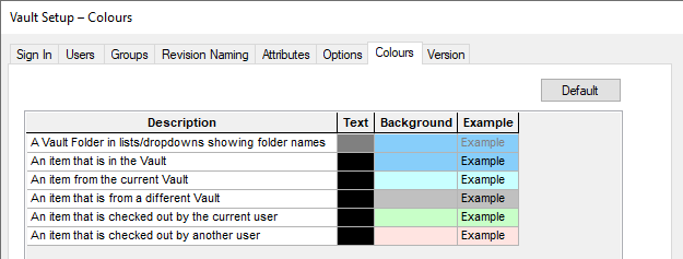
Throughout the application colour is utilised as means of highlighting and distinguishing various elements of the Vault interface. This dialog allows the colours used to be modified and tailored to meet an individual users particular needs.
Using the dialog
Vault Colours

The Text and Background columns define the colours used for the interface item shown under Description.
Clicking on the colour cell brings up a colour palette, where you can select a predefined colour, or define a custom colour by selecting Other…
The Default button will reset all items back to their default colours.
Attribute Colours
You can also colour items based on their attribute values. After selecting an item type from the drop down box, you can add or remove Attribute Colour Rules associated with that type. The Attribute Colour Rule options will become available once your connected Vault database is updated to the correct format version.

The New button will add a new blank Attribute Colour Rule to the grid.
Each grid row represents an Attribute Colour Rule and consists of 4 parts.
- Attribute Name - Specify from a combination box the attribute to define the rule with.*
- Attribute Value - The value that the attribute must have to activate the colour rule.
- Text - The cell text colour to be used.
- Background - The cell background colour to be used.
A preview of what the Attribute Colour Rule would look like when active is displayed in the Example column.
* Note - The combination box of attribute names are filled from a list of attributes that are associated with the Vault for that data type. These can be modified from the Vault Setup - Attributes Page
The Delete button will delete the current selected row.
The Default Colours button will reset the colour definitions of the selected row to default.
Related Topics
Vault Overview | Sign In | Users | Groups | Revision Naming | Attributes | Options | Colours | Status | Version