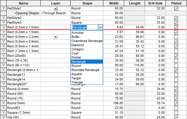
Throughout the Pulsonix system, where there is a need to display complex two dimensional information, a ‘grid’ approach is used to present the data in a familiar spreadsheet style.
An example of a grid from the Pad Styles page of the Technology dialog as shown below.

Editing the values in a grid
As well as displaying information in an easy to understand form, the grid is fully functional and like a spreadsheet, will allow you to quickly modify the values contained within individual cells simply by clicking on them and editing.
The Edit on Double-Click only option makes it possible to switch grids to a more traditional spreadsheet mode of operation where cells only enter edit mode when double clicked rather than single-clicked.
Special Cell Types
Some grid cells have special behaviour and when clicked will respond by presenting a list of choices in the form of a dropdown list. Cells showing a colour will allow the colour to be changed by displaying a popup colour palette. Checkbox cells may be toggled simply by clicking on the check box.
The small Triangle on the top left of the first cell in each row indicates the row state once it has been visited. Red is Error, Blue is Warning, Orange is for a new row and Grey indicates a modified row. This is available for all technology pages that have a Used or Enabled first column, e.g. Styles, Layers etc. For Rules pages only, a Green top right triangle indicates the rule contains a note. Hovering over the triangle cell will show the Error or Warning message in a pop-up window.
Numeric Values
Most cells will accept a simple expression (e.g. 6*0.135 or (9.5/2)+2.2). Length values are in the current design units, but you can specify alternative units when you enter a value (e.g. 1mm).
Read only Cells
Some cells may display information that can not be changed and are effectively read only cells. Clicking on these will have no effect.
Cell Shortcut Menus
Colour and checkbox cells also have a shortcut menu, available by right clicking the mouse. This may be used to quickly set all the other cells in the same row or column to the same value.
Resizing Grid Columns
When a grid is used for the first time, all its columns will have default widths. These may be resized to match your own particular needs by positioning the cursor over the appropriate column heading separator, the cursor will change to indicate that the column will resize, press and hold down the left mouse button and drag the separator to the desired width.
Once a column has been resized it will remain at the new width permanently unless it is explicitly changed again.
Scrolling in Grids
When a grid contains too many rows and/or columns to display in the space available, scroll bars are displayed to allow the grid to scrolled in the appropriate direction.
In addition, Microsoft� Intellimouse functionality allows the mouse wheel to be used to manipulate the contents of the grid as follows:
- Scrolling by rolling the mouse wheel.
- Scroll horizontally by pressing Shift and rolling the mouse wheel.
- Zoom in and out by pressing Ctrl and rolling the mouse wheel.
- Auto scrolling by clicking the mouse wheel button and dragging the mouse up, down, or to the left or right.
- Click Lock for the mouse wheel button: Just click and hold down mouse button for a moment and your click is locked. With Click Lock you can scroll the grid very easy by simply dragging the mouse (just the same as with auto scroll but you do not have to hold the mouse wheel button down). Click again to release Click Lock.