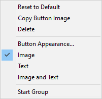
With the Customise dialog displayed, you are placed in a customisation mode of operation. In this mode you can right click on any button in any toolbar or menu to access a shortcut menu to change the button appearance.
Locating this option
Available from: Tools menu > Customise option > Context menu
Using the shortcut menu

Choose from the options below:
- Reset To Default - Use this to change the appearance back to its original default settings.
- Copy Button Image - Use this to copy the image from the button for use when using the Button Image editor.
- Delete - Use this to remove the button from the toolbar or menu.
- Button Appearance - Displays a dialog to control the appearance of the button. It allows you to select a new image for the button or define your own button image. This dialog is described in more detail later in this help.
- Image - Select this to use just an image for the button. No text will be displayed.
- Text - Select this to use just text on the button. No image will be displayed.
- Image And Text - Select this to use text and an image for the button.
- Start Group - This defines whether the button is the start of a group of buttons. If a group, a separator will be included before the button in the toolbar. This will not be available for the first button in the toolbar as it assumes it is the start of a group.
Note: Some toolbar buttons represent popup bars or specific parts or symbols. When right clicking on these you get a Change Name dialog instead of the button appearance menu. Use this to change the name of the popup bar or the name of the part or symbol the button represents. If you want to get the button appearance menu for these buttons you have to use the following method. In customise, drag any other command over the top of the button you want to change. When it is directly over the button, right click and the appearance menu will be displayed for the button it is over.
Button Appearance Dialog
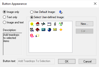
Selected from the shortcut menu (described above) this option displays the following dialog:

The dialog is split into four sections:
Choice of Appearance - At the top left of the dialog use the radio buttons to choose between Image, Text or Both.
Description - Shows a description of the tool the button represents. This is not editable.
Button Text - Enabled if you have chosen to show text on the button. Leave as the default option name, or type in your own text to display on the button. To reset the button to use the default option name, use the Reset To Default option from the shortcut menu (described above).
Button Image - Enabled if you have chosen to show an image on the button. Choose between using the default image (shown next to this option), or using a user defined button image, in which case the user image palette will be enabled to allow you to select one. An initial set of images are provided, but you can alter these or add new images using the Add and Edit buttons next to the image palette. When either of these buttons are pressed the Button Image Editor dialog is displayed to allow you to create your own image.
Button File Location
Customised buttons/icons (when using New or Edit) are saved in the file UserImages.bmp and once edited, can be copied and distributed to other systems or users. This file is located in C:\Users\person.main\AppData\Roaming\Pulsonix
Note: Swap out person above for the login name of the person for where the source edited file should be copied from.